The brief.
ServiceAtWrk is AtWrk’s field-service management platform, covering jobs, forms, assets, stock and billing for clients across retail, security and facilities. Six years as design lead turned a product that had grown reactively into one coherent system across iOS, Android, web admin and CRM.
The problem.
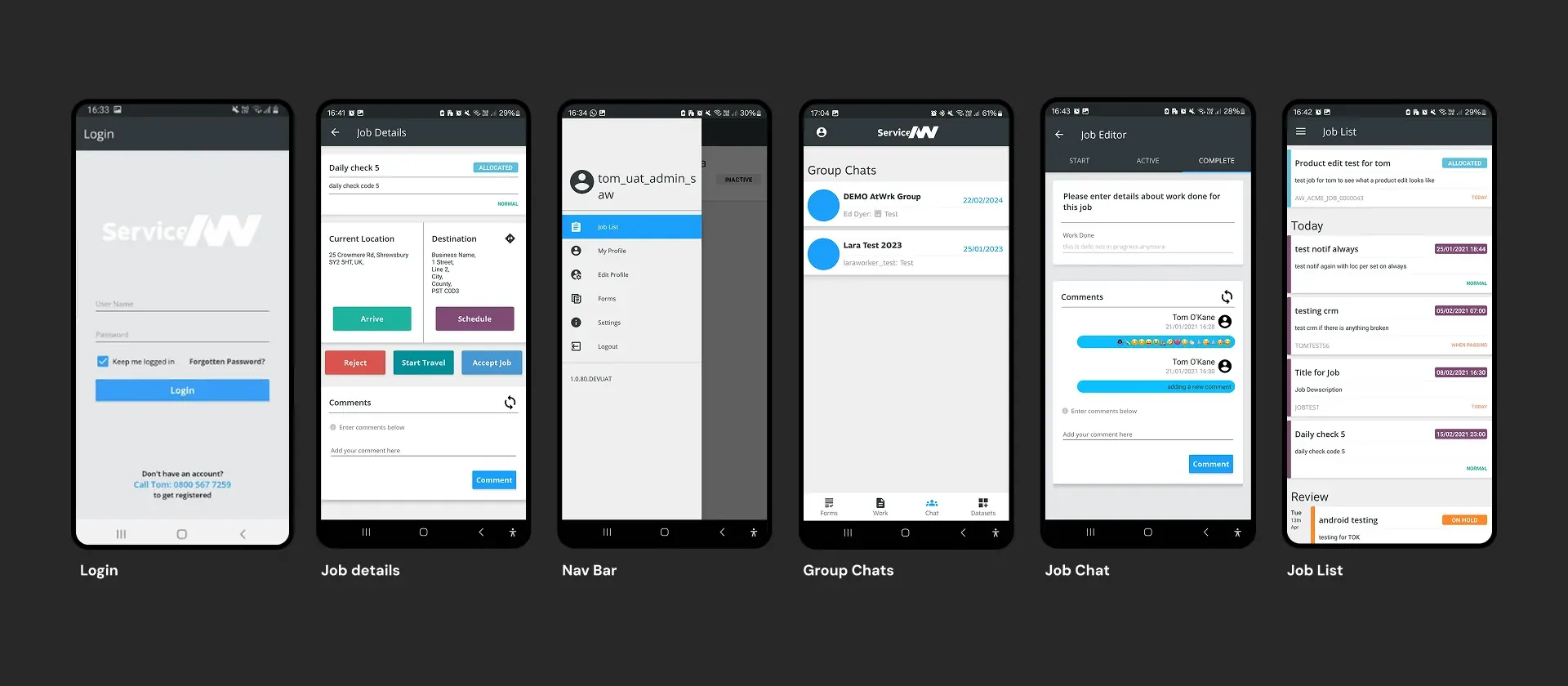
Features had been added reactively, often without research or design input. With no design tokens and no Figma workflow, even simple updates were costly, and each page felt like its own isolated system.
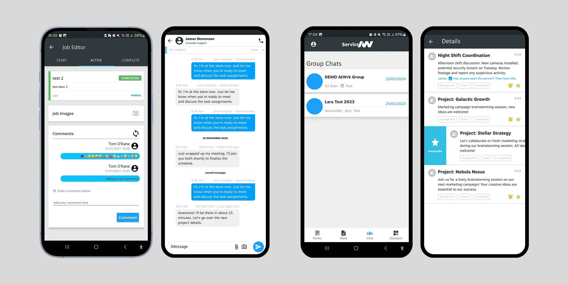
- The job details page — used by every engineer daily — buried status updates, notes and assignments
- In-app chat sat unused while teams ran jobs over WhatsApp and phone calls
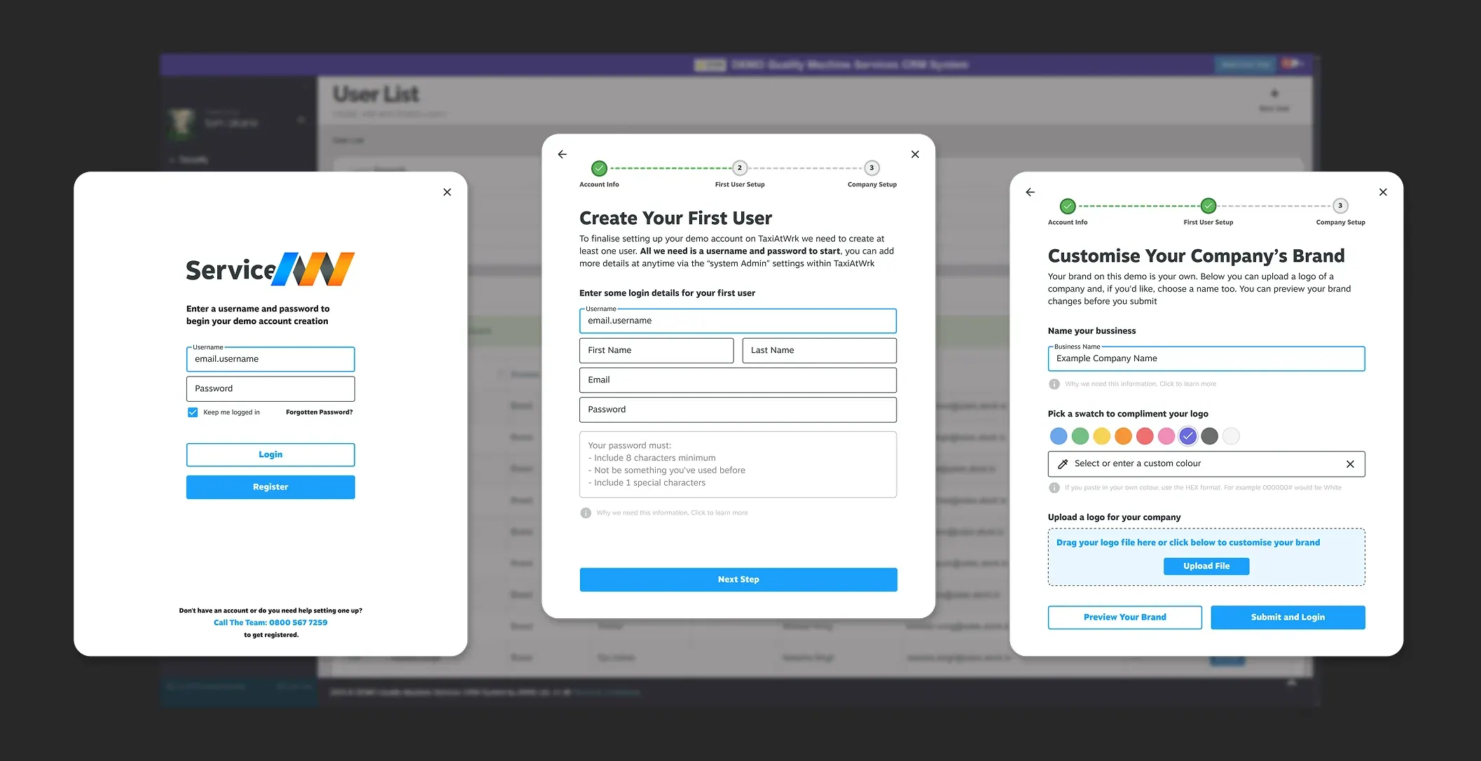
- Onboarding ran to 12+ screens, and returning demo users couldn’t log back in
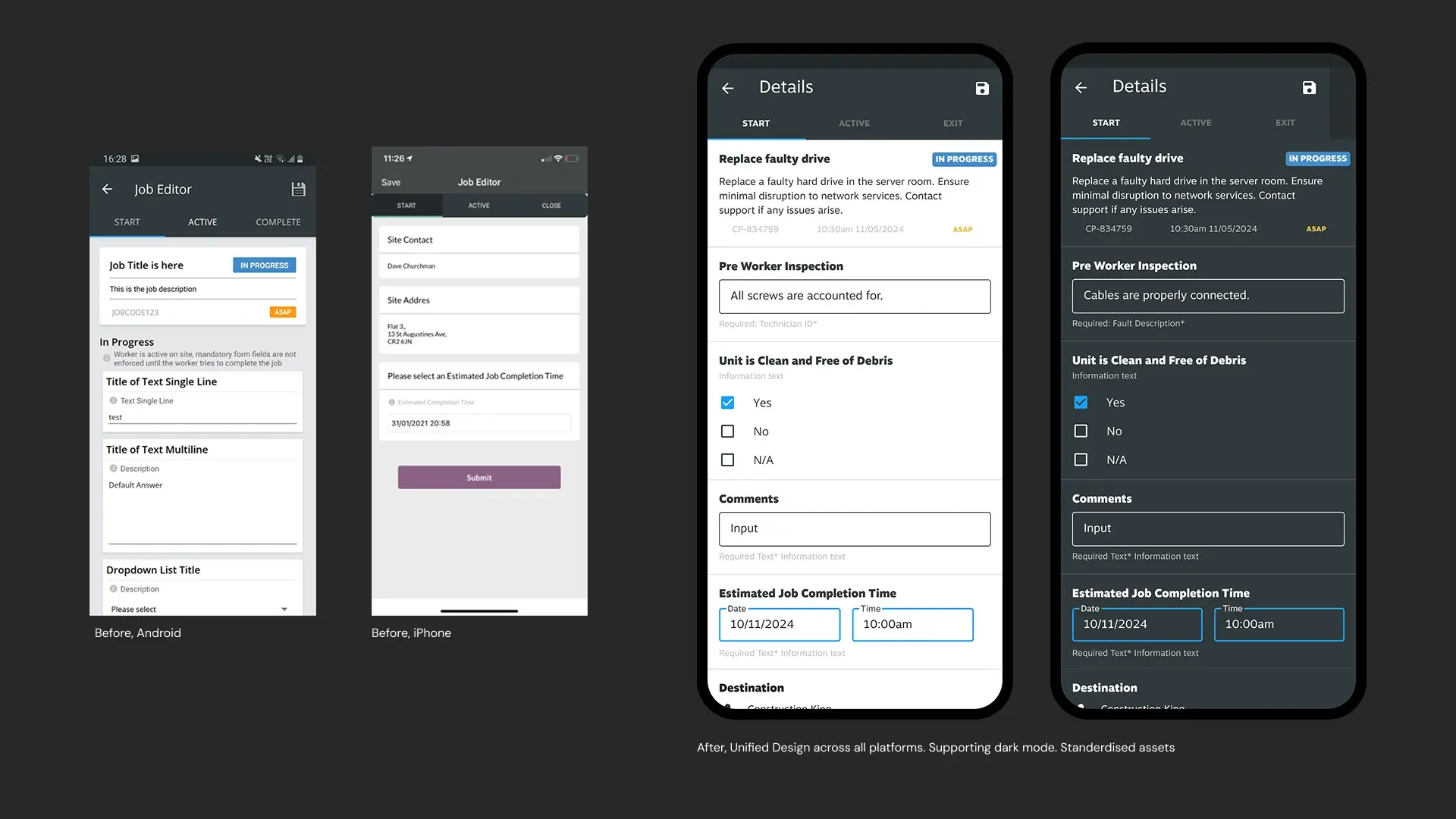
- iOS, Android, web and CRM each used different, outdated UI elements
Our approach.
Customers and their field workers were interviewed across industries to find the highest-impact friction, which became the requirements for the MVP.
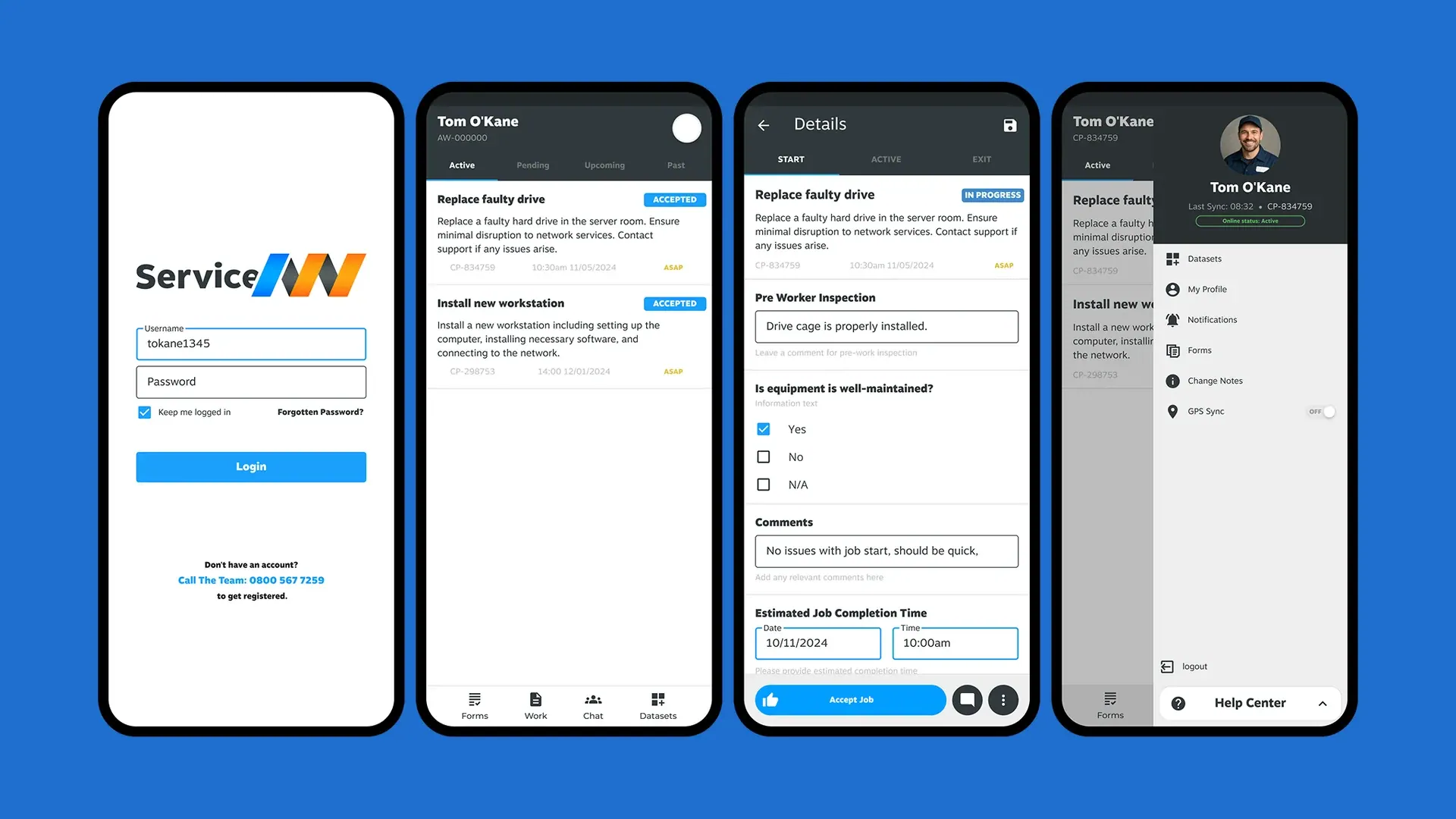
- Job details rebuilt around Start, Active and Exit tabs, with key information up front and status always to hand
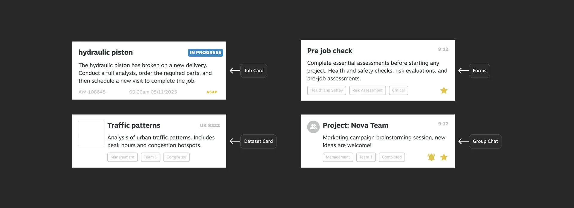
- Chat moved next to the primary action, with group chat modernised around tags, favourites and mute
- Registration cut to three guided dialogues with a visible progress indicator
- A Figma-to-Flutter pipeline proven, with every platform aligned to Material 3
The impact.
Engineers returned to in-app chat for job updates, sales demos ran more smoothly, and smaller clients could get started without paid hand-holding.
- Onboarding cut from 12+ screens to three dialogues
- Chat adopted for job updates instead of third-party tools
- One design language across four platforms
- Role-based documentation paired with a self-hosted AI help system to reduce support requests