
The brief.
THIS IS ME is a neurodiversity screening tool inside Support Connect’s Empowerment Passport platform, used by young adults alongside an educator, therapist or support worker. Support Connect wanted a fresh-eyes UX audit ahead of a roadmap conversation.
The problem.
For a tool built around empowerment, much of the experience worked against the very people it was designed for — neurodivergent young adults, often arriving already carrying weight about being ‘different’.
- Full-width report pages pushed line lengths far past comfortable reading
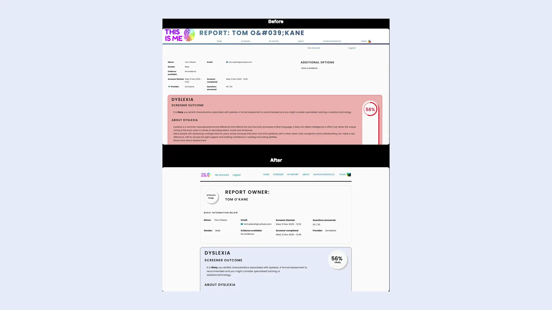
- Red badges and red card fills on every trait read as problem flags
- A 47-question point acted as a false finish line, with no save points
- A pattern-recognition captcha, and no visible GDPR, age or guardian consent step
Our approach.
The tool was reviewed through a dual lens — as a UX practitioner and as a persona living with dyslexia, dyspraxia and autistic traits — with the first session run alongside a therapist who works with neurodiverse children and adults.
- Thirteen findings grouped across width, colour, flow, accessibility and consent
- Recommendations ordered by cost versus benefit
- The four highest-impact findings taken into a Figma redesign of the report page
- Consent gaps reframed as compliance exposure, not UX polish
The impact.
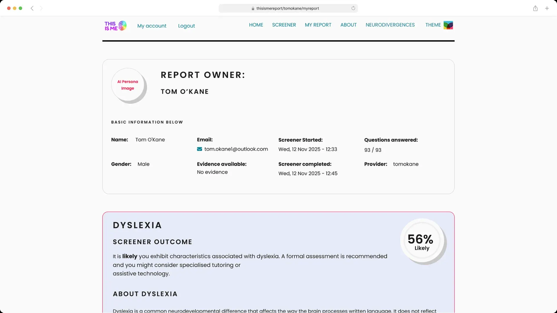
The cheapest fix landed first: the recommended 1280px content width now runs on the live report page, and the neutral trait grid is the basis for ongoing visual work.
- 1280px max width shipped on the most-read screen in the tool
- A non-red alternative moved the colour discussion from taste to a concrete design
- Save points and section selection defined as scoped engineering requirements
- A reusable bordered text-card pattern for long instruction blocks